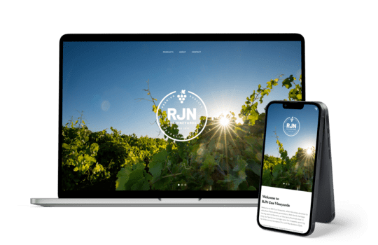
Case study | RJN Vineyards | Website
A crisp new website for Australia’s juiciest grapes.
The team at RJN Cua Vineyards have been so hard at work growing sweet, delicious grapes, they haven’t had a spare moment to think about their website for years! With a huge global fruit exhibition planned for the end of 2022, it was a great opportunity for the team to turn their focus to looking their best for the event.

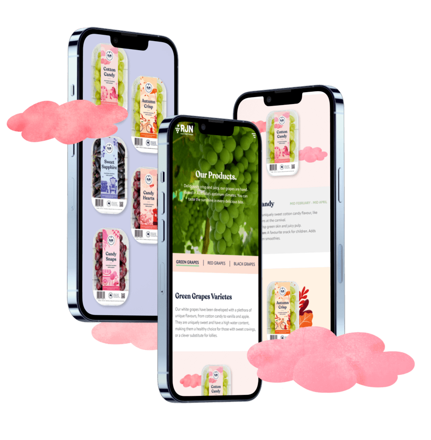
First, we teamed up to work on some delicious new packaging designed to make their grapes leap off the supermarket shelves. Our designers enjoyed creating custom digital illustrations for a selection of their grapes, whilst our copywriters got to work crafting tasting notes and serving suggestions for each variety – it was a scrumptiously creative job all round!
Once the UX designers had planned a new wireframe and the client was happy with this structure, the branding team and web team joined forces to bring the style of the new packaging and other newly developed print collateral to life online. What a joy, what a treat, what a delight! The client was all heart emojis and excitement when they saw this design, so we couldn’t be happier! Now, RJN Cua Vineyards is headed abroad to represent Australia’s fresh fruit scene with gorgeous new packaging, collateral and a sparkly new site. Have fun, guys!

“❤️❤️❤️ Amazing. Honestly amazing. Thank you for all your hard work. The design work has been fantastic and you have made it very easy for me”
- Joey Cua, RJN Cua Vineyards
Are you ready to take your brand to the next level?
Contact Us