Case study | Wind Chimes | Ecommerce
Product immersion in every sense
A website to showcase the beauty of sound.
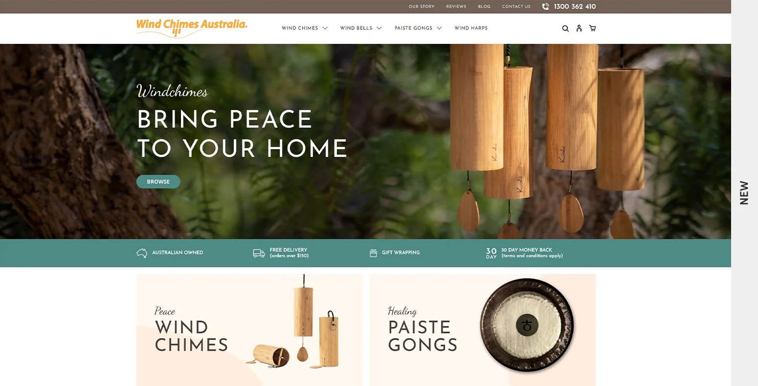
Wind Chimes Australia offers high quality, hand-crafted wind chimes, wind bells and gongs from around the world, delivered Australia wide. They needed a new site to showcase their beautiful products. And that’s where we came in.
The Challenge
How do you sell the visual and audible experience of a product in an online shop?
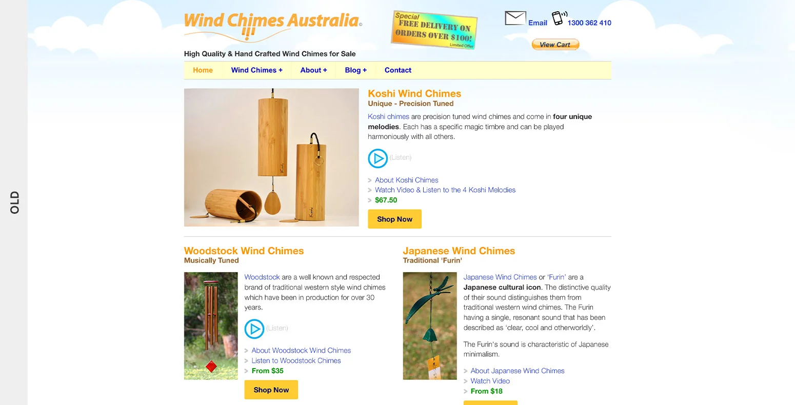
The previous Wind Chimes Australia website was dated both visually and functionally, resulting in missed opportunities in the consideration and purchase of their products.
The business needed to showcase both visual and audible product attributes and offer a seamless ecommerce journey to their customers. They wanted a new website to reflect their growing offering, immerse their customers in the experience of their products and offer a superior user journey.
The Approach
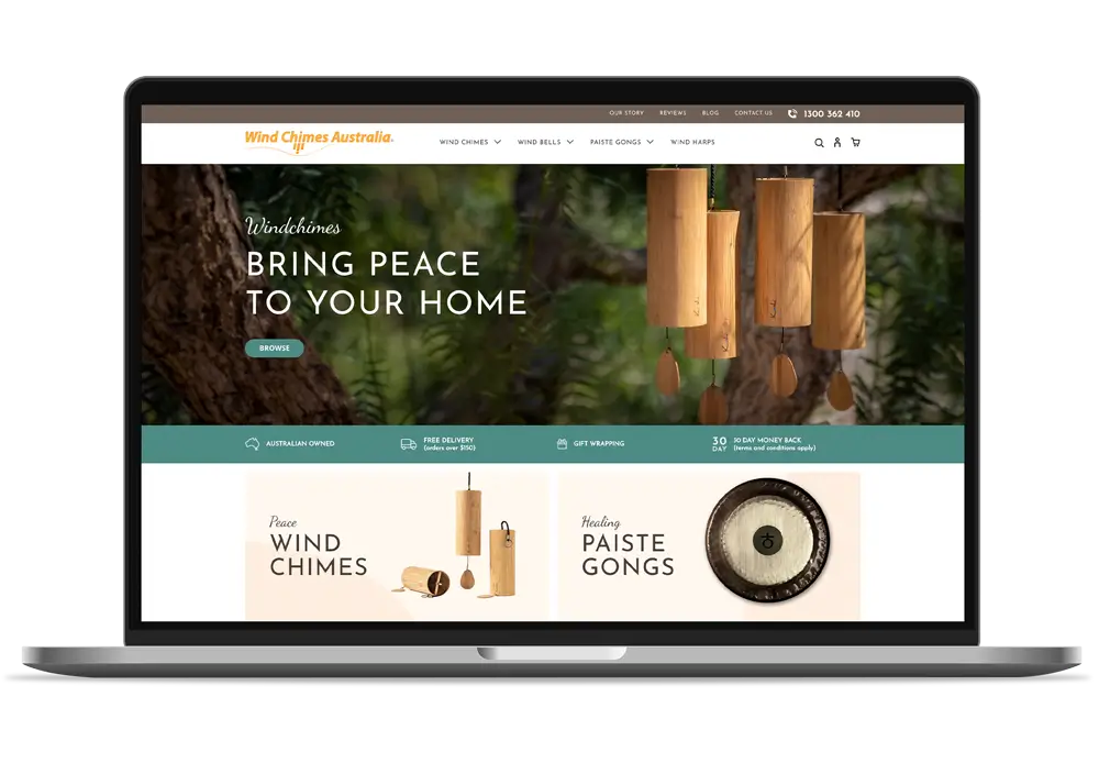
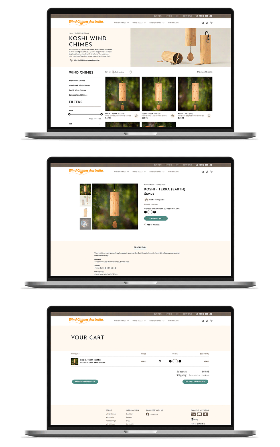
It was important that we designed a website that felt calm, earthy and inspirational in order to help users really experience the products on offer.
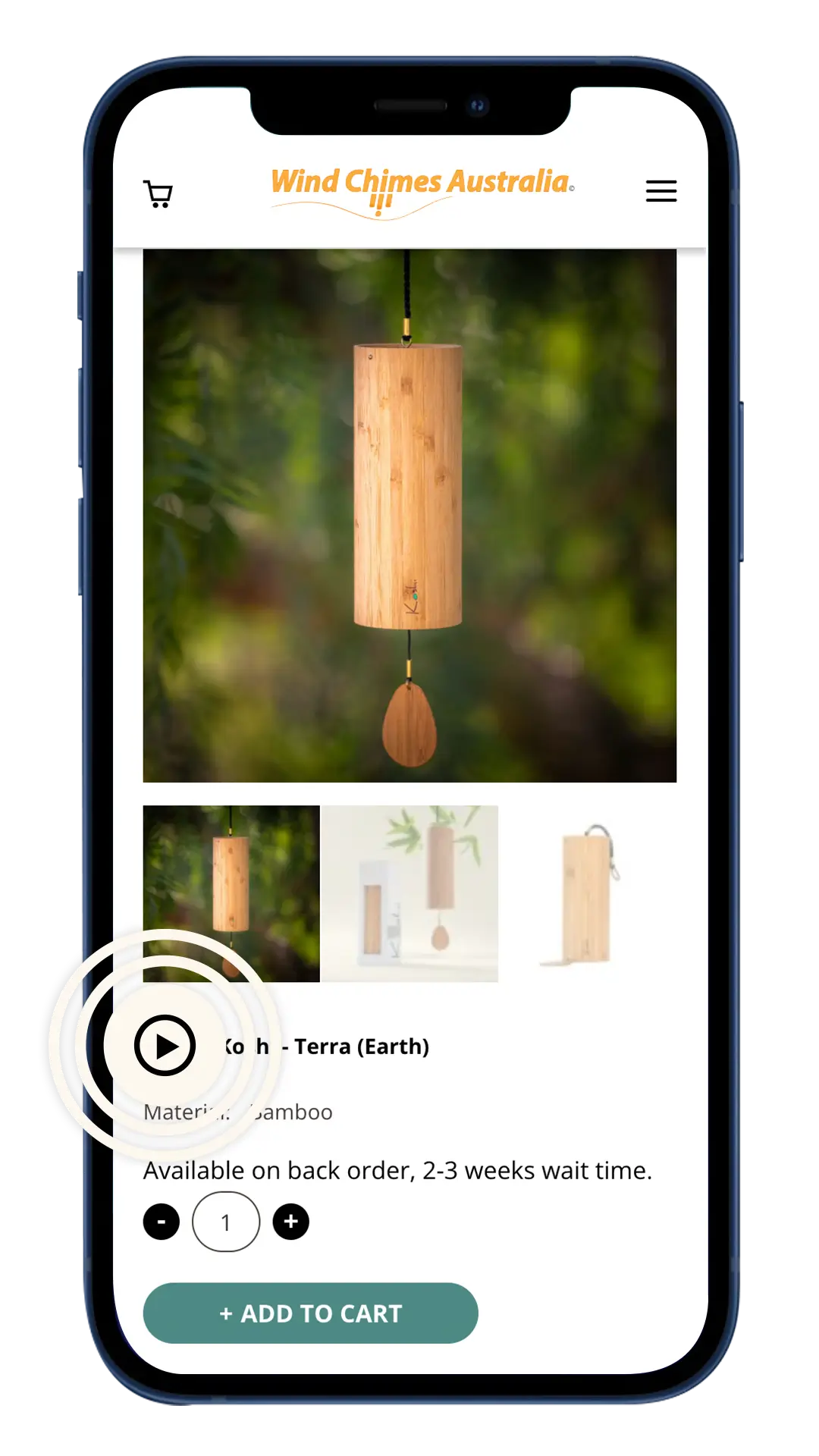
We worked with Wind Chimes Australia to showcase all of their products in a beautiful gallery style shop. Customers are able to play audio of the products in use and products are categorised with filter options available to easily match users with their desired purpose. The new site incorporates a WooCommerce checkout to offer a superior experience over the previous site’s Paypal only option. And the responsive design and development ensures users can access the site on all devices.
The Outcome
The new Wind Chimes Australia website offers users a visually and audibly beautiful and inspirational experience with responsive and easy navigation.
Wind Chimes Australia loves the sustainability and aesthetic of the site as well as the efficient usability and scalability of the backend. An increase in visitors and sales in just the first few months has seen the team very happy with the result.
Are you ready to take your brand to the next level?
Contact Us