Case study | Suzuki | Ecommerce
One Hardcore Makeover
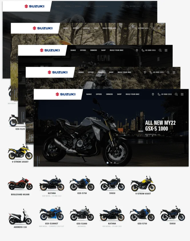
Having successfully built the brand new Suzuki Motorcycles website, with the popular Build Your Bike feature, it was time to build a microsite for each Suzuki dealership. Each microsite draws much of its content from the main Suzuki website, but features information specific to the dealer.

The Challenge
The challenge was all in the planning. As there are 100+ dealerships, we decided to build 5 microsites first, in order to test the functionality, before doing a mass rollout. One of the biggest new developments was the Find A Bike module, which shows the customer which bikes each dealer has in stock.
The Approach
Together with Suzuki, we combed through the existing main website, deciding on which components would be pulled through to the dealer microsites, which content would be locked, and which would be editable; which areas required modification or reworking, and what needed to be added. We built one version of the dealer site and worked through some updates and new ideas as they came to light – like changing the way the dealer locator functioned and looked. Then we created five dealer sites and gave them to the dealers to play with, customise and test drive, before rolling out the entire dealership range.


The Outcome
Each microsite is co-branded and can be managed by the dealer; it’s a powerful business asset where they can promote their unique offers, range, pre-owned bikes, social media, about information, opening hours and more. The response from dealers has been extremely positive. They appreciate that the majority of content is automatically fed from the Suzuki parent site, so their website always looks great and features the latest campaigns.
Are you ready to take your brand to the next level?
Contact Us